Wednesday 30 June 2010

Michael Bastian collaborates with Gant.

The American born designer Michael Bastian has teamed up with the American clothing giant Gant to produce a capsule collection for Autumn Winter 10. Based around the sport of Lacrosse, the collection shares a similar aesthetic to that of Bastian’s own collection but with a young more accessible design and price. The designer had this to say on the collection “I see my version of the Gant guy as the younger brother to the Michael Bastian guy. He's more casual, and a little more athletic, but with a modern edge that feels both approachable and sophisticated”.

Using a nice mix of formal and casual the collection has an all-american rugged edge featuring highlights including unstructured tailored blazers, a washed moleskin pea-coat, chunky hand knit sweaters and that favourite of mine, the shirt rendered in a variety of cloths such as poplin, flannel and oxford cloth. The range will be available from 25th August at Selfridges and Gant’s own Regent St and Brompton Rd stores as well as online. I know I for one will bust a gut to get my hands on it before it flies off the shelves.

I also hear of more good work from the team at Gant this time from their Home department They have been appointed the job of interior decorating the prestigious Kennedy Green House, it would appear Team Gant been very busy….

Wednesday 5 May 2010

Foot You Believe It?

As those sharper eyed amongst may have noticed a lot of my current attention is upon my feet and the items that adorn them. A current trend that many of you may have noticed is the re-emergence of menswear classics. Brogues, Oxfords, Desert Boots, Derbys and Deckshoes, to name but a few, are again at the forefront of the fashion conscious.

While I constantly pine for more shoes, it is, at present, the classics I crave. I, more than most found myself at little surprised when the latest shoes from Cat landed on my desk. My initial thought was to dismiss it as those purveyors of steel toe capped worker boots my Dad wears whilst pottering about in the garden.

But I lazily let my eye skim through the press release and was pleasantly surprised by Cat’s foray into more fashion forward footwear.

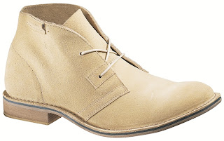
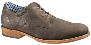
The two styles that most caught my eye were the desert chukka boot, and the suede derby, both of which have a great blend of being classic style and fitting into the aforementioned trend whilst also being rugged enough to not be so far down the fashion road as to loose it’s appeal to the wider demographic. A fine balance.

Sunday 4 April 2010

Deckshoes. SOS?

I have long since been a fan of deck shoes, I like their preppy aesthetic and the ideal notion of romping across the seas aboard your yacht tying ropes and securing masts while your feet are secured and comfortable by the nautical classic.

As with many, the debate in me rages as to who makes the best out of the two big power houses, Sperry or Sebago?

I bought a pair of Sperry’s last year and must admit they have served me well, but as of yet I have no comparison. I also enjoy the more fashion forward or alternative spins on any classics, so when I recently heard Sebago were bringing out a limited edition range of their classic deck shoes but rendered in new, exciting colour ways and materials, this seemed to tick all the boxes for my next deck shoe purchase. My appetite was whet….

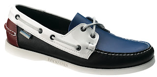
Finding inspiration from the collaboration with Colette (another Stevie Style favourite) the 1946 Collection has the perfect balance of classic deck shoe style with the pop of colour and difference I am searching for this summer.

Released on 1st May it is a very limited collection with only 8 pairs of each colour available in the very few stores that will hold the range. Featuring a limited palette of red, black, white and blue, (again classically nautical) they use the colours in interesting areas of the deck shoe that may not normally receive attention. The heel for example, or a use of patent to give extra glean to the upper all part of the impeccable detail, as is the ‘Dockside’ embossing on the sole of each of the three pairs.

Featuring all the classic features as well such as the square leather laces rendered in black and white, the shoes are a stand out piece I can’t wait to add to my ever increasing prepped summer wardrobe…. Now just need some half decent weather! Roll on May 1st and prolonged sunshine….

Sunday 17 January 2010

World Wow 2: Bravo Bailey!

The genius of Christopher Bailey seems, thankfully, to know no bounds. Returning again to Milan to show, last night he debuted the Burberry Prorsum AW10/11 collection, and what a collection it was.

All Images Courtesy Of GQ

Heavily inspired by World War II, it seems Bailey has again trawled through the archives of Burberry and classic British menswear, re-evaluated it then torn up the rule book.

All Images Courtesy Of GQ

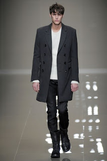
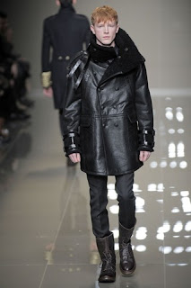
The most noticeable thing about the collection is the stunning coats, that were sent out in their droves, commons themes across the coats being gorgeous button details, oversized proportions, head-swallowing collars, shearling lining and fluidity, oh the fluidity! Whereas the original WWII version were rigid wools and thick cottons, these coats breathed movement, flexibility and decadent comfort.

All Images Courtesy Of GQ

Classic peacoats, flight jackets, reefers, trenches and mac’s were all given a modern overhaul by the Burberry’s Northern Creative Director, featuring oversized buttons, or in some circumstances a conglomeration of buttons to add an embellished standout feature, seen below as wrist cuffing. Others being made in striking colours or leather as opposed to more usual wools and cottons.

All Images Courtesy Of GQ

Again Bailey used a neutral colour palette of murky tones, khaki and brown in varying tones as well as the occasional look with more steely tones of grey and blue. This made the odd piece that didn’t fit in with the palette standout with shining brilliance such as the pictured (below) sumptuous white jumper. Or just as a flash of exuberance such as the previously mentioned button cluster embellishment this time seen on the shoulders of a jumper.

All Images Courtesy Of GQ

Sometimes what’s interesting is not what’s done but what isn’t. The strict bottom half throughout the collection of the same steely grey trousers tucked into only a minimal few pairs of boots resonated strongly that this collection was clearly about the top half and statement coats.

All Images Courtesy Of GQ

This collection was intelligent and strong playing on investment classics that will have men buying to last for seasons, but with enough about them to make them classics for a modern age.

All Images Courtesy Of GQ

With such a strong start to the menswear scheduling the remaining shows have a lot to live up to and I for one can’t wait….

Sunday 10 January 2010

Gant 60th Anniversary

A little while ago I received a press pack from Chase PR about Gant's beautiful 60th anniversary shirts and the glorious rich history of the company. The pack is printed on beautiful textured cream paper and came in a large envelope and contained a bound booklet and some separate sheets on the history of Gant. Following leafing through the pages I promptly went and bought one!

As part of the celebration Gant made 6 limited edition shirts, reinterpreted versions of classic styles. The 6 styles are The Sea Island, The Hugger, The Rugger, The Pullover, The Cashmere and The Hubby.

A press shot of 'The Cashmere'

The shirt model I got was The Cashmere, so called because its composition is 80% cotton and 20% cashmere. To touch the shirt feels heavenly, a touch that is often replicated on high streets with soft cottons, but that softness fades with washing. When the cashmere is within the shirt, made up of its very fibres, you know that softness will stay! Mmmm!

G. Bruce Boyer

Further luxurious details include sumptuous stand out mother of pearl buttons adorning the placket and the button down collar, made popular by Gant’s shirts, which G. Bruce Boyer points out gives a “consummate roll to the collar – achieved by placing the buttons three inches down from the neckband on a three-and-one-half inch collar point”, and flap front pockets with the pattern cleverly aligned so they are almost invisible. I love the shirt, everything about it is perfect and yet luxurious for a casual shirt, the fit, the texture, the richness of colours, the buttons and that roll of the collar!

My new shirt!

Another detail that I really like are the labels, not only in there vintage style, but also in there content. Each limited edition shirt label, across the six styles, tells which Gant store the shirt was exclusively supplied to and sold in. I think this gives the shirt real character and I enjoy that it has an ‘original home’ before its new pride of place in peoples wardrobes. Just above this label is another thin label containing the model of the shirt, another wonderful little detail. It’s maybe as I get older or perhaps as my taste develops that I am really starting to appreciate the details even more than I have previously. It’s what make garments stand out from others, and adds the interest and intrigue for me at the moment and why I really enjoy and appreciate this shirt in particular.

The vintage style labels up close.

Bernard Gant, the company’s founder, I was surprised to learn, invented several traits to his shirts, that now are de rigueur on many shirts today, including the locker loop, that tiny loop found on the centre of the back across the shoulders. The commerative booklet in the pack further adds on the locker loop - “Ivy Leaguers used to call it the ‘lucky loop’ because girls would rip the loop off the shirts of guys they thought were cute”, now whilst I love this romantic endearing notion, if some girl decided to rip any shirt of mine, especially this beautiful effort I would be less than impressed, needless to say it would not be the best start to a blossoming relationship!

I was further surprised to learn that he also invented the box pleat, the button on the back of the collar for keeping the tie in place as well as introducing the USA to the preppy staple, the button down collar.

Locker loop, box pleat and collar button? Check!

Gant was a label I often, foolishly, overlooked thinking it without much heritage and all too similar, though not as high end, as Ralph Lauren, but reading the material I have been sent has since seriously changed my perspective.

Initially started as predominantly available on campuses, the shirts, a preppy aesthetic stalwart, soon took off across America and beyond. From such humble beginnings, so popular did the Gant staple shirt prove that soon the company expanded to whole ranges of clothing, from head to toe.


Now readily available across the globe one of the more recent exciting projects was an advertising campaign using 10 real New Yorkers, shot by Scott Schumann (of The Sartorialist) allowing them to incorporate Gant items into their favourite looks. The results, very cleverly, allow Gant to be shown as a versatile brand that can fit in with a range of styles.

One of the ten New Yorkers.

Another modern clever marketing ploy Gant are soon to release is an iPhone application. This will tell you where the twenty nearest stores/retailers of Gant products are at any given moment anywhere in the world. As well as showing you the latest trends, styles and catwalk shows allowing you to be kept bang up to date with current collections and products. A very clever app both for user and the company, it seems the Gant wheel just keeps on turning....


Wednesday 30 December 2009

The Brogues Are Back In Town!


Well, technically they never left though like some abusive vagabond, through neglect and a plethora of London dance floors they’re not quite looking their best. Scuffed, marked and tired it’s time they were given a new lease of life. After all, it’s the season of good will and I’m getting spoilt rotten so why not bestow some of this care and TLC upon my beloved brogues.

Since I’ve bought the Grenson Archie’s a year last September, I am ashamed to say they have seen less care and attention as they deserve or should have, save every once in a while thrusting a shoe tree into their red leather lined inners or resting them for a few days.

Poor old brogues!

However Christmas, coupled with a heavily abused bankcard (I’m really not that abusive I promise you) means I can’t afford to take them in to a cobblers for a professional reinvigoration and also quite relished the challenge of doing it myself, and know I will take more care and passion in doing it than some of the ten a penny cobblers. (That said, there are many fine cobblers out there, and if you find a good one stick with them! Maybe you could send me a list of good cobblers you know and use for future reference? I’ll post the findings on this very blog!)

The jaded practice shoes...

Now I’d recently read an article on the art of polishing your own shoes and how best to do it. I had forgotten where, though that veritable fountain of menswear knowledge Steve Salter at Style Salvage filled in the blanks. Gentlemen’s Corner imparted the following article. After reading through and practicing on some other tired old shoes for practice, (see above and below) I decided I’d found a decent method…

...Don't look too bad, method found!

So I set about my favoured shoes, part with excitement at rejuvenating them and part tribulation that my inferior hands we’re about to work on shoes made and prepared by real craftsmen!

I applied a light smear of tan over the whole shoe, section by section. Working it in with some brusque polishing action! After this had given a fairly even colour and had covered all the scuffs and imperfections, I left it overnight for the polish to dry and soak into the leather. This is important so you know the true colour of the polish and can see where needs more or less work.

After one coat of polish on one shoe.

I then went over the whole shoe again repeating the process, really massaging the polish into the leather. As mentioned on the Gentleman’s Corners blog, polishing your shoes is similar to moisturising your face, not only vital and imperative but also the key is to make sure the polish really goes into the leather and doesn’t just sit on the surface. To do this I kept intensely rubbing and buffering, gripping the shoe with my legs and shimmying the duster over my shoes!

After a couple of coats to each shoe.

Now this looks good (in my personal opinion) and I felt fairly happy with the results, however I wanted to really add some character. I’ve heard and read on several occasions from many reliable sources that rubbing black boot polish over tan brogues lightly then wiping it off adds depth and character and lines the holes, really creating a vintage lived in look but still with the care and appearance of polishing.

Now while I didn’t want to risk black, for I didn’t want them to go that dark, I did want the aforementioned effect. I chose to start with a mid tan to see the results and effects, and had a mid brown on hand should I want to further my polishing investigation. As I ran the mid-tan over the toe cap and holed areas, it was coming out a bit darker and more uneven than I had planned, so I stuck to the mid tan, to give it a mild contrast to the light tan I had been buffering.

The morning after with one shoe having a mid-tan coat

After again leaving it to dry overnight I felt it didn’t actually look too dark and the slightly unevenness of the polishing actually added depth and interest and didn’t look too dissimilar to burnished calf effect some shoes have.

The toe-caps up close.

So here they are, my adored Archie’s refreshed and refurbished, a tad darker than original but the better for it! I am delighted with the results and can finally wear them out again with pride at having done it myself!

The final results with the tools of my work.

What do you think of the final results? Any public or expert opinion on what’s good or could have been done better would be greatly received!

There are several things you can and should do to maintain your shoe collection. (One of my new years resolutions, as well as extending my shoe collection, is to adhere to the following list absolutely!)

1) Use shoe trees – shoe trees help not only retain the shape of your shoes but also stretch the leather to stop it becoming creased, they also absorb the excess moisture out of the leather and shoe deposited by your metacarpals.

2) Do not wear the same shoes day in, day out. Not only will your shoes start to smell horrific as they will have no time to air and dry out, but the retained moisture will attack and destroy the leather quicker than you can say ‘gosh darn it, I liked those shoes…’

3) Get a decent cobbler, any disintegration in soles or tears and damage in the uppers can and should be instantly repaired by a cobbler. Obey this rule I saw on a cobbler stub “Shoes worth wearing are worth repairing!”

Too true!

4) Polish your shoes on a regular basis. The massaging of wax into the leather will help soften it, making it more supple but also prolonging its life. Helping to protect the leather from water, snow, friends drinks, that odd coloured cocktail a mate spilled on you etc. And generally make them look all round smarter and more spick and span. (There is also an old wives tale that women judge a man on how polished his shoes are…. Is this true? Has anyone else heard this?)

Wednesday 23 December 2009

Neck It!

OK so following another week of discovery, this time challenging myself to be without my beloved shirts (results soon to follow), I return to formality and a new challenge, oh so apt for this festive season.

After recently giving my wardrobe a quick spruce (yes, I said spruce) I found many items that have lain dormant, neglected and unloved for some time. Many of them being neckwear accessories of some description. Ties, bowties, scarves (both evening and warming varieties), cravats, even oversized pocket squares all aching to be worn. While, as I have previously mentioned I do love formal flair, I often ignore the neck area focusing more embellishment upon the chest pocket of my blazer.
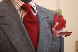
Why not do both? Like this fine E.Tautz mannequin picture over at Style Salvage?

Now, I feel, is the time for change. With the build up and following period of Christmas upon us everyone accepts a little more pizzazz (yes, I said pizzazz) and sense of ‘dressing up’ which should avoid sniggers from those who know oh so little! (Surely you don't even care what they think or say anyway? I know I don't, fashion should be fun!)

This week I challenge you to adorn your neck with varying garments to stretch your accessory horizons, enjoy dressing up, and harking back to a time of class and decadence!

Such grace and elegance from one of the finest exponents of accessorizing, Mr. Fred Astaire

With this I don’t just mean throw on the same mundane scarf you’ve been wearing all season! Oh no! Really experiment with what’s in your wardrobe, or better still buy something new! Christmas upon on us and a short breath from the inevitable sales what better time, or raid your favoured vintage/charity store for archaic gems.

I have taken a lot of inspiration recently from accessorizing new areas and realising just how much could be achieved, obviously from the fine fellow above but also Messr. Salter at Style Salvage, and Messrs. JKissi and Trav at Street Etiquette with not only their general out look but also the two linked stories in particular.

One man who I know will have no problem with this challenge, is a good friend of mine Aaron over at Individualism. His use of neckwear accesories has long been a source of inspiration to me, both in how and what he wears but also where from. Trawling high and low, high end and thrift stores, he even goes so far as to accessorize his findings with more accomplishment; collar pins, studs, tie clips and more have all dazzled, tiny but mighty, from his outfits. I await his results from the challenge with bated breath.....

Image courtesy of FaceHunter

I am lucky enough to already be fairly suitably stocked (though the bankcard may get a minor bashing!) with a lot of produce from the fine purveyors of dandy accessories Peckham Rye (look out for the imminent interview I recently had with the fine gents behind the British treasure trove) so keep your eyes peeled on twitter for my day to day wears!
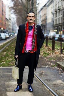
Image courtesy of The Sartorialist

As ever I will post my results at the end of the week and would love you to do the same, send pics to my twitter or to Stevie.Style09@googlemail.com or just post them in the comments box below!

Monday 21 December 2009

Block Paving

In more than a handful of shows this season have we seen solid blocks of colour paving the way in the fashion stakes. The current trend adds interesting shape and form to the human figure and really breaks up the silhouette and serving to highlight particular sections of the male form.

As a loftier fellow, having horizontal blocks of colour running across my body certainly helps break up my frame, subconsciously making me look broader (never a bad thing) and dare I even say it, less ‘lanky’ as I am often titled.

It has been used in many forms across the season, some choosing to have only two colours with one predominant darker shade covering the whole body over several pieces and then one block of colour highlighting a stark contrast to the rest of the outfit as seen at Raf Simons (above). Look how it highlights the model’s shoulders and arms, oh to wear a garment that made my arms so bulked and empowered! What I really love is how it detracts from the less flattering areas and highlights a man’s natural ‘V’ , with the clever use of a belt to aid the effect. Giving a modern day herculean physique all in one coat! How clever! The white is made of neoprene, a fabric becoming more and more common in high-fashion after ‘those’ neoprene trenches by Burberry a few seasons ago.

Elsewhere, the outlandish use of fabrics and bright colours really broke up the block muted tones of other shows. Christopher Shannon, a fine exponent of fabrics and colours, used many different hues stacked all the way down the torso. Snatching my attention on the catwalk with such vivid eye-catching blocks. What a delight it would be to parade so bright and loud down the street, drawing the ‘oohs’ and ‘aahhs’ that he received during his show.

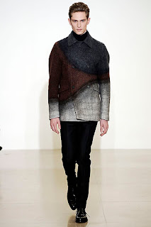
One of my favourite examples of block colouring came again from Raf Simons but this time under the guise of Jil Sander’s name. The coat (as seen below) is a thing of such beauty that it leaps straight to the top of my wish-list (Winter Wardrobe). The use of different shape instead of blocks adds such intrigue and reminds me of joyous times by the seaside filling those tiny bottles with different coloured sands, this is a suggestion and memory I long to wrap around my torso and warm me against the winter chill.

(NB I know, as the more eagle-eyed of you will have no doubt noticed I've mentioned the above coat and Jil Sander's and Raf Simons collections twice in as many posts, but trust me, their work and collections make it OK! But I will avoid such blatant endorsements of one man in such a short space of time again!)